Saturday, March 21, 2015

The stages of Pouty Face

Many times when working on a portrait I post pictures of the piece in progress on my Facebook page. I've found that people really love to see the progression and the layers build up. I've noticed that artists and non-artists alike enjoy seeing how it works so here is the progression of colored pencil layers as I was working on the Pouty Face portrait I shared in the last blog post.


Here I've just got the basic outline in and I'm working out my palette while starting to get some darks blocked in.


You can see that little strip of paper on the side- that's where I test my colors. For this portrait I'm working on a dark blue Canson pastel paper. It's actually darker than it looks in the photos. When I took these pics I was just using my phone at the drawing board. The board is right in front of 2 windows so sometimes the colors shift depending on the time of day I took the picture.


So here I'm beginning to build up skin tones. Any time I'm working on colored paper I cut an extra strip of the same color paper to test the pencils on- especially for skin. On this paper I couldn't use any of my usual portrait colors that have yellow in them. You know what happens when you mix yellow and blue..... he didn't need to have green skin.


I used lots of peachy and orangey tones to work the skin. Surprisingly deco orange got used a lot. I hadn't considered it right away but it really worked.


In this pic the lips look a lot more orange than they really were. They were a bit of a challenge though to get them pink enough without them turning purple on the paper.


He's almost done here- just building up the background colors and the red of his shirt. I went back into the eyes to push the values a little more and then back into the hair to fill it out with more strands.


Pouty Face is done and Pouty Face happens to be my youngest grandson. He is quite the character so I'm sure I'll be doing more portraits with his very expressive self.


Saturday, March 14, 2015

What have I been doing?

Boy do I have some updating to do!! I've done a lot of work since posting last so I'll share a few pics...

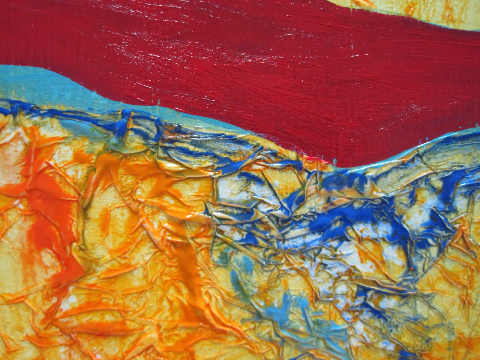
These are brand new landscapes inspired by aerial photos I took as I was flying into Tampa airport. These pieces are very textured. I used Super Heavy Gesso and many layers of drybrushing. Size wise they're 11x14 and 12x12.


This one is the newest tree piece and the largest one I've done- it's 48x36 and it has tons of texture. I covered the entire canvas with layers of tissue paper.


Then..... there's the colored pencil work. I've been doing some commission work and of course doing portraits of my grandbabies. Pouty Face is the one I just finished this past week and I think it's one of my faves. Harlen is such a character I know I'll be doing more with his beautiful face.


This gorgeous animal is Winston and he was a commission piece for a dear friend of mine. He was a real joy to paint and a real challenge too. That hair!!!


Yep, still partying. Friday Painting Parties are still happening. In fact I'm now doing an afternoon session along with the evening. Last month we did a scene from Tuscawilla Park - Ibis Morning, a line up of birds along the waters edge.


This month we're doing a landscape....


Just one more bit of news for now- a show at Gateway Bank! Check this out. The reception is passed but the show is up until May 26th.


There's a sampling of what I've been up to. Leaving for now but I'll be back! I swear! I'll be adding new work to the pages up at the top and I'll post more of the portrait work including photos of the work as it progresses. See you soon. 


Friday, April 11, 2014

These might end up in a painting someday


A while back I was traveling north on 441 on my way to Gainesville. In McIntosh, on the right hand side, is a great little antique shop that has this out front. Any store that has something like this sitting out front is just screaming at me to stop and see what's on the inside!


What did I find inside? The coolest collection of bottles I've seen anywhere. There's just something about old bottles- the frosty softness of the glass, the way the light filters through and gives them a glow from within, the smooth curve of the glass where so many hands have touched.


Colors bounce back and forth. Blue, gold, lavender, green - all points of the spectrum shine and entice, begging to be shot and captured. Of course the shop owner was smart in the way he displayed the bottles - on shelves in front of mirrors with strings of lights in the just the right places.


What was contained within these shapes? What fragrance, what poison, what remedy? Who belonged to the hands that held the bottle and wished for healing or relief or maybe just a buzz?


Was there a reason for the shape of the bottle? Why do some bottles have ridges and bumps on the outside? I asked the owner of the shop these questions. He told me that some bottles were manufactured with a particular design specifically to protect the consumer from accidentally using the contents in a way that would harm them. Bottles meant to contain poison such as insecticide would have bumps in a pattern or embossing on the outside of the bottle that actually said 'poison'. If you were up in the middle of the night with a stomach ache, it's dark and you're going by feel to find your medicine, you won't make the mistake of drinking something that's not meant to be ingested. Good thinking! If you're interested in more info about the history of bottles, check out this site.

Anyway, learning these little tidbits about the bottles makes them even more interesting. It's not a subject I'm painting right now but I'm hanging on to these pictures because one of these days.... you might see a new series begin. When that happens you'll know where it started.


Tuesday, April 8, 2014

Popping colors and crumpling paper.

The last week of March and first week of April were some crazy, busy weeks! I had the Friday Painting Party going on and my 2-day acrylic workshop down in the Villages on April 3rd and 4th. They have a great space down there at the Lifelong Learning College classroom at Spanish Springs - lots of tables, good demo area and good munchies. I had a couple of familiar faces from the first workshop I taught there back in the fall, and met some great new people.


We were doing landscapes with texture and complimentary colors. One of the techniques I showed them was how to do the tissue paper texture that I demonstrated in this video. It's one of my faves for doing landscapes. It just lends itself so well to the subject. And of course, adore working with complimentary colors to make the scene pop!


Some of the folks had to leave early and missed the critique time but these lovely ladies stayed and shared their projects. I love this part of doing workshops - when we line up the work and see what everyone accomplished. They did such a great job! Everyone was open and willing to jump out of their comfort zone and do something completely different. Some were really cranking out the work too - one painting after another, amazing.


I'm looking forward to working with the college and doing some more classes and workshops. :D

Sunday, March 16, 2014

Influences

Through the process of working on a grant application and writing about my work I became more interested in the surrealists. When I first started my Silent Voices series I didn't think about what 'ism' that work would fit into. It wasn't a case of intentionally setting out to create surrealist work, it was a case of putting a very personal and emotional part of my life on canvas. In fact I don't generally care about any 'isms' when I'm working. It's not something I think about.

Frida Kahlo
What the Water Gave Me

Frida Kahlo was a painter who didn't separate her life from her art. I always admired her courage and the openness with which she shared herself. I wanted to create like that - with the freedom to say something with the work and be comfortable doing it.

Rene Magritte
Son of Man

It's been a very long time since art history class in college so I went to the book store and picked up a book on the surrealists to refresh my memory of some of the other painters. One of them jumped out at me.... Rene Magritte. Of course we're familiar with the one above - Son of Man but it was interesting to see other of Magritte's pieces.

Rene Magritte
Georgette

I could really relate to his imagery and style, especially in his piece Georgette. Can you tell why? I had never seen that particular painting of his before last week.The way he blocked off the elements in the picture, the candle, the envelope, the 2 faces, the egg (a theme in some of my pieces) - interesting. It's also interesting to me that he uses the bird nest in some of his other work. Makes me wonder if I really had seen much more of his work way back when and it was just buried in my subconscious, waiting to bubble up and appear as an influence. Something to think about....


Friday, March 7, 2014

Yes, I still do colored pencil

I know I've posted a lot of stuff about acrylic painting but I do still paint with colored pencil on occasion. I do portraits in colored pencil using the tonal layering technique that gives such a smooth finish to children's skin. This is one I did some years ago but it's new to the portrait page here. I just added it recently. This is my niece Kayla (she's now 22 yrs old!) and it was one of my favorites to do along with the one of her playing with bubbles - click the portrait tab above and scroll down to see that one.


I also added the portrait of Kayla's brother Grant....


The background on this one is a lot looser. I like the scribbly pencil stroke look sometimes plus it's faster to do and is a nice contrast to the smooth layers on the figure.

Then there is the super fast way to work with colored pencil and that's what I'm doing now on an abstract piece. I use mineral spirits with the pencils to turn the dry pigment into paint. I LOVE working this way. Yesterday I turned the camera on to show you a few minutes of how I paint with a pencil.


Tuesday, March 4, 2014

Goings on

What the heck happened to February? It was a busy month and looks like March is going to be even busier! Lots of projects to work on. Getting started on the project for this month's Friday Painting Party.....


We're going abstract this time. Some of the ladies want to loosen up and try something different so I'm having them play with tissue paper to texture their canvas and then we'll play with color and design.

This past weekend I went back to Macon to pick up the work from my show. While there I met with the gallery director at the Macon Arts Alliance Gallery, Heatherly Wakefield. She checked out the show before we took it down and made a selection of pieces for me to take to her gallery so she'll be carrying my work there. How cool - I now have a gallery rep in Georgia! Since I brought some work back to the studio I had to rearrange, of course. I did a new arrangement on the studio wall...


So what else is happening this month? Working on my entry for the CPSA International Exhibition which is coming up this summer right here in FL. The convention activities will be in Daytona Beach and the exhibition itself will be in Ormond Beach at the Ormond Art Museum. I'm so excited! This is the first time the CPSA show and convention will be in Florida. The deadline for entries is March 31st so if you're one of my colored pencil followers, get coloring.

And...... I'm teaching a 2 day workshop down in the Villages the first week of April so I need to get busy prepping for that. It's all about painting landscapes in acrylic. It'll be a fun time. There are some very enthusiastic painters down there. :)

So, that's what's going on in my studio.... what's happening in yours?