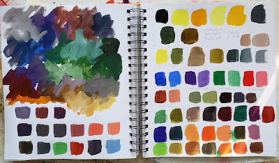
Keep scrolling and you'll see why I haven't posted in a few weeks. I couldn't tear myself away from my studio! It's a lovely problem to have. I'm still working with the sketchbook from the last post. I got some new colors in from Nova so of course I had to do some swatches, mixes, and playing. Bits and pieces of these pages have been working themselves into finished paintings. It may be recognizable or it may not, but the book definitely sparks ideas and helps keep the momentum going.
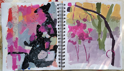
Loving these colors! I was playing with black, white, magenta, and cad yellow. Black, cad yellow and white can make the most wonderful sage greens.
You can see the influence of this one on Quiet Time below.
I don't know where this one will lead but I'm sure bits of it will show up on a canvas at some point.
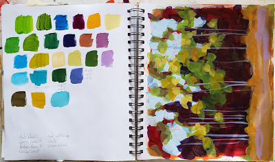
Testing out new paints. At the top I was playing with more black and yellow mixes using Hansa yellow and Indian yellow.
This is a mess - but I like the colors. It's just a sketchbook.
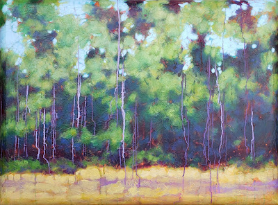
Quiet Time
36x48
This one is on a convexo canvas. Instead of flat sides it has a beveled edge. I textured the entire canvas with tissue paper before painting.
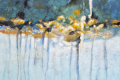
Riverside
24x36
Riverside is painted on top of a painting I did years ago. I kept the basic composition but pushed the colors and values. I added drips, dots, and a band of interference color that shifts depending on the way the light hits it.
Coastline
10x30
I don't usually work on this extreme shape but I was gifted the canvas by a neighbor and loved it!
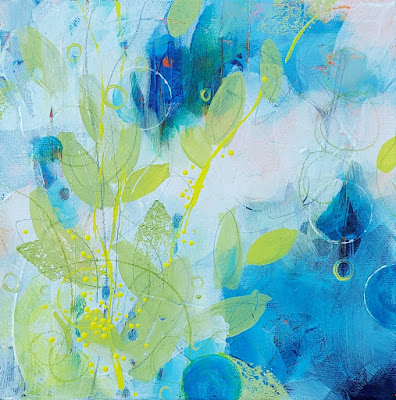
8x8
This one was a bit of fun. I do love circles, they show up in almost everything but this time I thought I'd add leaf shapes too. Is it done? Who knows.
8x8
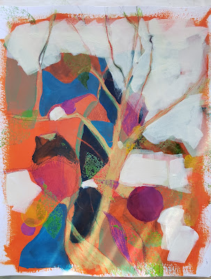
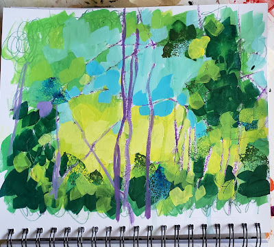
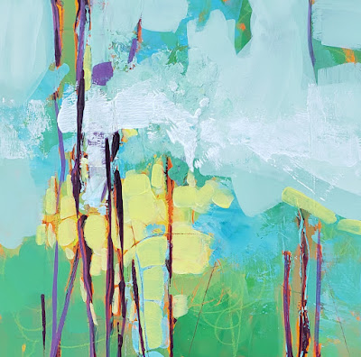
The mess of a page? I told you I loved the colors - creamy yellow, light bright greens and blues with a kick of purple. This is where it's going so far. I'm still deciding what else to do with it. I'm also playing on a different surface for me. I picked up some cradled wood boards and wanted to see how I felt about painting on a rigid panel. Do you have a preference? Wood or canvas?
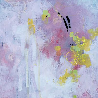
12x12
I went for a muted palette this time. I still wanted the bright yellow but I wanted to tone down the bright pink and make it more of a dusty pink. For the black accent I used ultra matte BLK3.0. To set off the flatness of the black I finished the rest of the painting by using a satin varnish. I'm still deciding on a title for this one. Feel free to leave suggestions in the comments below!
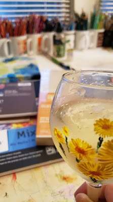
After a month of studio time, February started out with a full art immersion. Friday night was First Friday Art Walk downtown and then Saturday, hubby and I went to the Mt. Dora art festival, then on to Orlando to Sam Flax for supplies like that wood panel I'm playing on, and we got back to town just in time for a lovely reception at 8th Ave Gallery. New supplies, looking at fabulous art, and talking to other artists is a reason to celebrate and the inspiration continues....
Now I hope it won't be a full month before posting again. I'm trying to be better about it. I'm not exactly sure what's up right now but I feel like something is shifting. Maybe my work is moving in a new direction. Maybe something is brewing. Do you ever have that feeling that something is changing but you can't quite put your finger on what it is? Hey, maybe I'm about to have a creative breakthrough!! It would be cool to think so. Or maybe I'm just reacting to stress and hiding in my studio feels like the best place to be right now. I really don't know. I'll take it either way because I'm painting and most importantly, I'm learning. If you feel compelled to make stuff - just go do it.

No comments:
Post a Comment