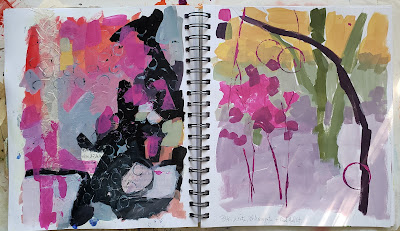
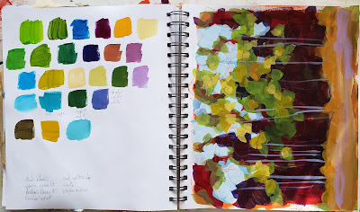
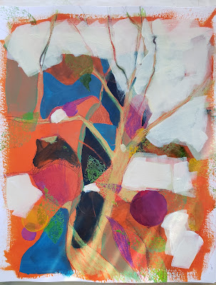
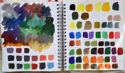
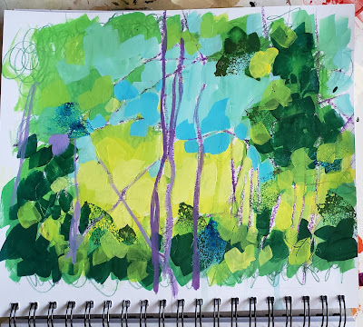
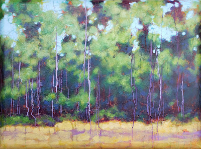
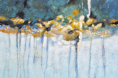
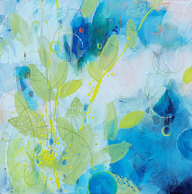
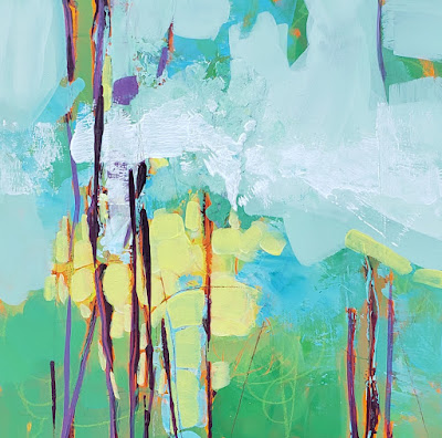
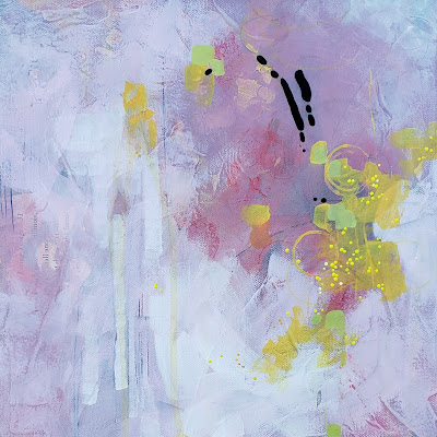
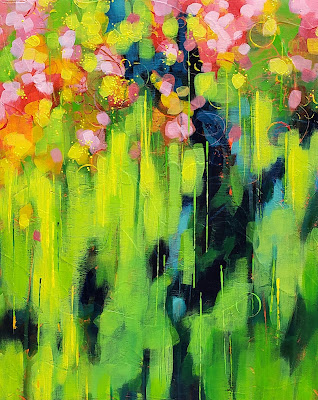
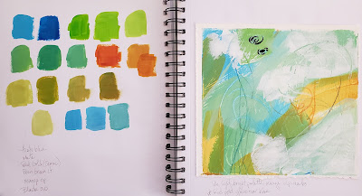
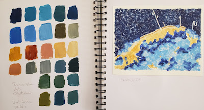
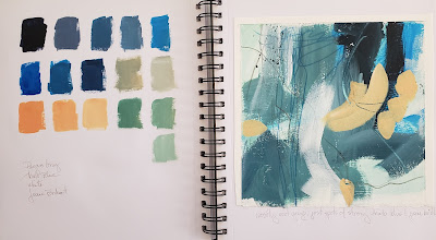
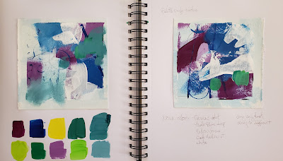
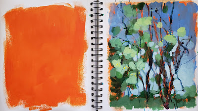
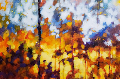
Keep scrolling and you'll see why I haven't posted in a few weeks. I couldn't tear myself away from my studio! It's a lovely problem to have. I'm still working with the sketchbook from the last post. I got some new colors in from Nova so of course I had to do some swatches, mixes, and playing. Bits and pieces of these pages have been working themselves into finished paintings. It may be recognizable or it may not, but the book definitely sparks ideas and helps keep the momentum going.
Showing posts with label abstract landscape. Show all posts
Showing posts with label abstract landscape. Show all posts
Wednesday, February 9, 2022
Is there life outside the studio?
Loving these colors! I was playing with black, white, magenta, and cad yellow. Black, cad yellow and white can make the most wonderful sage greens.
You can see the influence of this one on Quiet Time below.
I don't know where this one will lead but I'm sure bits of it will show up on a canvas at some point.
Testing out new paints. At the top I was playing with more black and yellow mixes using Hansa yellow and Indian yellow.
This is a mess - but I like the colors. It's just a sketchbook.
Quiet Time
36x48
This one is on a convexo canvas. Instead of flat sides it has a beveled edge. I textured the entire canvas with tissue paper before painting.
Riverside
24x36
Riverside is painted on top of a painting I did years ago. I kept the basic composition but pushed the colors and values. I added drips, dots, and a band of interference color that shifts depending on the way the light hits it.
Coastline
10x30
I don't usually work on this extreme shape but I was gifted the canvas by a neighbor and loved it!
8x8
This one was a bit of fun. I do love circles, they show up in almost everything but this time I thought I'd add leaf shapes too. Is it done? Who knows.
8x8
The mess of a page? I told you I loved the colors - creamy yellow, light bright greens and blues with a kick of purple. This is where it's going so far. I'm still deciding what else to do with it. I'm also playing on a different surface for me. I picked up some cradled wood boards and wanted to see how I felt about painting on a rigid panel. Do you have a preference? Wood or canvas?
12x12
I went for a muted palette this time. I still wanted the bright yellow but I wanted to tone down the bright pink and make it more of a dusty pink. For the black accent I used ultra matte BLK3.0. To set off the flatness of the black I finished the rest of the painting by using a satin varnish. I'm still deciding on a title for this one. Feel free to leave suggestions in the comments below!
After a month of studio time, February started out with a full art immersion. Friday night was First Friday Art Walk downtown and then Saturday, hubby and I went to the Mt. Dora art festival, then on to Orlando to Sam Flax for supplies like that wood panel I'm playing on, and we got back to town just in time for a lovely reception at 8th Ave Gallery. New supplies, looking at fabulous art, and talking to other artists is a reason to celebrate and the inspiration continues....
Now I hope it won't be a full month before posting again. I'm trying to be better about it. I'm not exactly sure what's up right now but I feel like something is shifting. Maybe my work is moving in a new direction. Maybe something is brewing. Do you ever have that feeling that something is changing but you can't quite put your finger on what it is? Hey, maybe I'm about to have a creative breakthrough!! It would be cool to think so. Or maybe I'm just reacting to stress and hiding in my studio feels like the best place to be right now. I really don't know. I'll take it either way because I'm painting and most importantly, I'm learning. If you feel compelled to make stuff - just go do it.
Sunday, January 9, 2022
A studio soul sister and 6 reasons to enjoy your sketchbook
In the last post I showed you a few little snippets of a painting I was working on. I finished it and it's still got a lot of color! It doesn't have a title yet so if you have any thoughts, feel free to share in the comments. It's 20x16x1.5 and the image continues on the sides of the canvas. To me, this feels like a field of flowers in spring.
This one was done, so what next? I wanted to do something different for the first week of the year.
Remember this post? I talked about getting the creative juices flowing again by playing with some small, loose abstract compositions. Some of those little experiments were finished and displayed. Some of them I didn't care for enough to show but I didn't hate them enough to throw them away either.
After the holidays I sometimes hit a bit of a slump in the studio so when that happens I like to read about and watch other artists for inspiration. You can always find a cool tip or tool to play with that excites the mind. I browsed through my art book shelf and also started watching YouTube videos. There's so much out there. One artist that caught my attention was Louise Fletcher. Oh my goodness, she's like a studio soul sister! She even uses pattern tissue in her layers like I do.
In this video she talks about how she uses her sketchbook to develop ideas. She does the same kind of exercise that I do with mini abstract compositions but then she takes the leftovers and saves them in her book, makes notes, and uses them for reference. Brilliant! I gave it a go.
In this next one, I'm testing out some new paint I just ordered. I've never tried Nova paints. They're an acrylic made in CA. I ordered a few colors to try them and I will be ordering more. The colors are wonderfully saturated. They come in jars because they're not heavy body acrylic. They seem to have a viscosity somewhere between fluid and soft body acrylics and have great covering power. I'm happy with them so far and will add them for certain techniques. For some texture effects, the heavier body paints still work better.
In the one below I grabbed some twigs from the back yard and used them like brushes to scribble on the page. I like the loose, organic feel of the marks.
I've always kept a sketchbook but I haven't used it as much in recent years and I usually just use it for graphite sketches. Now I'm enjoying this sketchbook practice for a few reasons.
- It helps me to work out design ideas for future paintings.
- I can work out color combinations and mixtures.
- I can try different techniques before taking them to the canvas.
- I can save all this to look at later when I need some inspiration.
- I make notes about what works and what doesn't so I don't have to reinvent the wheel when I'm working.
- No one ever has to see my studio work book unless I feel like sharing. I'm free to experiment and play and if it doesn't work, I learned something. If it works, I learned something.
The new year is starting off with lots of inspiration, learning and fun. I hope you're having a great start to your year. Check out some more of Louise's videos and let me know if you find any other cool artists to watch. Let's go 22!
Sunday, November 21, 2021
I've gone dotty
I shared a few close up pics of a new painting on my FB/IG stories yesterday. I wanted to share again here too because when you look at the entire painting it can be hard to make out some details. I mentioned a couple of posts back that I'm playing with a paint shaper tool to add a bit of pointellism. I just dip it in the paint and .........
What I'm doing isn't the true definition of pointellism - "a technique of painting in which small, distinct dots of color are applied in patterns to form an image" (think Seurat) - but using dots to enhance and add texture to a painting.
Below is the finished painting. If you enlarge it on your screen you can see where I painted the dots. Like the gold leaf I sometimes use and the textured gesso I put on the canvas before painting, sometimes seeing a painting in person is best. A painting can be experiential and doesn't translate as well in a photo.
still deciding on a title
18x24
20x20
Shimmer
20x20
acrylic and colored pencil
Shimmer was finished before I started the other 2 pieces so it's been added to my website along with the one below that finally has a title. It reminded me and many others of fire so Rekindled became it's name. It makes sense too because I seem to have rekindled a love for hot color!
Rekindled
20x30
And this one below..... I just remembered that I added it to the site but forgot to title it. I've been so focused on painting that I forgot all about it. It's more abstract than the others. Hmmmmm, something will come to me this week while I'm doing other things. I've been super productive in the studio the last couple of weeks so maybe I'm just getting ready to take a few days off with Thanksgiving coming up. My youngest daughter and her family are flying in and I'll have my local grandbabies here with me since they're out of school. It's time to focus on getting some work done around the house and wait for new canvases and gesso to come in the mail.
14x11
I hope you have a wonderful week. Enjoy being with your loved ones, eat good food, relax, and laugh a lot! Happy Thanksgiving!!
Wednesday, November 3, 2021
From black and white to The Secret Lives of Color
Giving Way
16x20
Above is the result of hopefully, saving, the painting from the previous post. It went through several ugly phases and now I can look at it without thinking "ugly"! I especially had fun adding the little dots with a paint shaper tool. It's hard to see in the photos but the dots are slightly raised, giving a little extra dimention to the painting.
Remember one of the tips from this September post? I mention printing reference photos in black and white in order to free yourself from slavishly copying color from a color photo. Well, it can also free you up to play with more than color. I think I went to town on this one. Is it even recognizable as the subject for the painting below? I had so much fun with it! If you have any title ideas, leave them in the comments. 😀 And to see the above painting along with lots more... head to my site.
I'm still deciding on a title
20x30
One more thing I wanted to share.... have you seen this book? The Secret Lives of Color by Kassia St. Clair is entertaining, educational and if you love color, it's luscious to look at too. I bought this for my kindle instead of the actual book but forgot that my kindle is only black and white. If you buy this, be sure to look at it on a device that has color. I'm reading it with a Kindle app on my tablet. Scroll down to see a few sample pages. I saved a couple of screenshots to share. Each page goes into the history of the color name along with how the color was developed - very interesting.
So, check out the book and enjoy the colors. If you're up north, you get to see these colors on the trees, in person. I can only dream and remember the golden yellows and oranges of autumn in New Jersey. Here in Florida, we only get a little color teaser in the fall so I'll be enjoying them in this fun book.
Subscribe to:
Posts (Atom)
