Showing posts with label abstract. Show all posts

Wednesday, February 23, 2022

Making something new to play on

Surprise! I know it's weird to see another post so soon after the last one but I just wanted to share a quick look at what I was playing with this week. When I was shopping at Sam Flax a few weeks ago I was admiring the accordion sketchbooks, or what some call concertina sketchbooks, and I was also admiring the price! I didn't want to spend that much on a sketchbook so I decided to make my own. I certainly have enough paper lying around the studio so I didn't have to purchase anything.

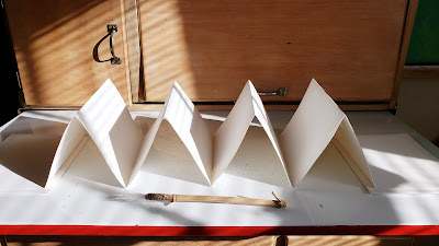
I used a full sheet (22x30) of 140lb Winsor & Newton watercolor paper. I cut two 8" x 30" strips from the sheet. I measured and marked every 6" on the two strips and then folded each one accordion style. Then I attached the two strips together to make one long one and glued the two ends to pieces of mat board that I had cut to 9x7 so the covers would be slightly larger than the pages. After the pieces were assembled I gessoed both sides of the paper and both covers.

I made the sketchbook Monday and yesterday I started playing with it. Here's a bit of video of me working on it. Yep, I know the camera should've been on the other side of the drawing board but the way my studio is currently set up I don't have a lot of options for placement. If I put it on the left side, it would have to be attached to the drawing board and the motion of me working at it would have the camera wiggling all over the place. I don't post a lot to my YouTube channel for that reason and I'm not a video producer. I'm just sharing little clips for folks who want to see a bit of the process. Hopefully I'll get better with time but right now, honestly, all my focus is on the painting process itself. I'd rather be painting than dealing with a tech learning curve. Sometimes, us old schoolers have to be dragged kicking and screaming into the current century. At least I've quit putting two spaces between sentences when I type and I'm even going to learn about NFTs! That's big and it might take a while for my brain to wrap around that concept. LOL 

Anyway, have a happy hump day everyone. I hope you're doing something creative. 


Friday, December 31, 2021

Setting My Intention

How I'd like the new year to be -  Glorious. In Harmony. That's how I'm setting my intention. By being in my studio this week; painting, feeling connected to nature, to creativity, to feeling, to joy. 

Glorious
20x16

In Harmony
30x20

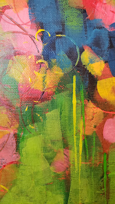
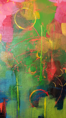
Letting myself paint this week without the feeling of urgency, the need to sell, the pressure of work. I just wanted to feel the joy of painting intuitively and not care about anything else. Below are a few close ups of the next one on the easel. Bold color everywhere! I love the compositions of these little snippets. They might be the inspiration for some smaller canvases in the future. I'll share the finished painting in the next post. 


So with joyful color, I wish you a very Happy New Year!! I wish for all of us to have love, creativity, and prosperity in 2022.


Wednesday, November 3, 2021

From black and white to The Secret Lives of Color


Giving Way
16x20

Above is the result of hopefully, saving, the painting from the previous post. It went through several ugly phases and now I can look at it without thinking "ugly"! I especially had fun adding the little dots with a paint shaper tool. It's hard to see in the photos but the dots are slightly raised, giving a little extra dimention to the painting.


Remember one of the tips from this September post? I mention printing reference photos in black and white in order to free yourself from slavishly copying color from a color photo. Well, it can also free you up to play with more than color. I think I went to town on this one. Is it even recognizable as the subject for the painting below? I had so much fun with it! If you have any title ideas, leave them in the comments. 😀 And to see the above painting along with lots more... head to my site.


I'm still deciding on a title
20x30

One more thing I wanted to share.... have you seen this book? The Secret Lives of Color by Kassia St. Clair is entertaining, educational and if you love color, it's luscious to look at too. I bought this for my kindle instead of the actual book but forgot that my kindle is only black and white. If you buy this, be sure to look at it on a device that has color. I'm reading it with a Kindle app on my tablet. Scroll down to see a few sample pages. I saved a couple of screenshots to share. Each page goes into the history of the color name along with how the color was developed - very interesting. 


So, check out the book and enjoy the colors. If you're up north, you get to see these colors on the trees, in person. I can only dream and remember the golden yellows and oranges of autumn in New Jersey. Here in Florida, we only get a little color teaser in the fall so I'll be enjoying them in this fun book.


Tuesday, October 19, 2021

Can this painting be saved?

An update post..... since I was here last I've shipped 10 paintings to the Signature Art Gallery in Tallahassee and I have 8 more boxed up and ready to ship to Macon Arts Alliance in GA. You have no idea what a relief it is to move some paintings around! Since leaving Gallery B brought many pieces back home, I needed to make room for new stuff. Thankfully, Macon Arts is having a special small works show in November so it's perfect timing. And the wonderful people at Signature wanted some new work for the holiday season. Yay all the way around and doing a happy dance. 💃

Shedding Light
16x20

The painting above is one of the new ones. I love playing with paint like this. It brings my two favorite things together - landscapes and abstracts. After painting that one I decided to try doing something a little different by toning the canvas yellow instead of red orange like the previous one.


so far so good.....


ugh!


now I really hate it....


maybe it's salvageable.

This is as far as I've gotten today so you'll have to stay tuned to see what happens to it. So far the only stage I like is the very first one. In the latest stage it's just starting to come together but boy, it's hard to get past the ugly stage sometimes. When you hit that point you have 3 choices - 1. trash it (gesso over it and try again)  2. grit your teeth and push on through. or 3. take a break, work on something else for a while and come back to it later.

I think I'll take door #3.

See you next time. Hopefully by then this will be resolved and I can share. 

Sunday, July 4, 2021

When you're between projects....

Happy 4th everyone! I hope you're doing something fun today. We have pretty lousy weather right now so I don't think we're doing anything outside, hence, the reason I'm sitting at my computer. 

So this is the kind of thing I do when I'm between projects. I just finished the last nest painting. I have 2 commissions waiting in the wings. I have multiple canvases prepped and waiting for new nests and landscapes. Before starting all that I wanted to play with something a little different. It always helps to get the creative juices flowing. 


I started with a full sheet of watercolor paper, gave it a layer of gesso, and taped it down on all the edges. Then I used the tape to section off 12 squares. With a large brush I started throwing acrylic paint around - thalo blue, light green and red gold. I also scribbled a bit with graphite and colored pencils.
 

While the paint was still wet I used the handle end of the brush to scratch into the paint and make more marks. I applied the white with a big kitchen spatula. You can see here that I peeled the tape away. 


I tore the squares apart using a straight edge. Since the paper has deckled edges I didn't want to use scissors and make the inside edges too clean. Tearing against the straight edge gives a more deckled feel. 

As a last step, I used my favorite black - BLK3.0 ultra matte black, to add areas of contrast. They're fun little abstracts! Now what do I do with them? I thought about framing them but I HATE framing. The hassle and expense of framing is one of the reasons I no longer do much work on paper but sometimes the urge is too great. So what now - I realized that these little guys fit well on an 8x8 canvas so I ordered a case. I'll paint them solid black and then mount the paintings on the canvas. I like the way the black edge frames the design. 

While I'm waiting for the canvas order to come in I can start working on the commissions. This is one of the best things about being a painter. I love having multiple projects to work on. Maybe it seems like I'm all over the place or unfocused to some folks but I never get bored in the studio! And it seems to me that working with multiple subject matter and methods can influence the other work you do. Isn't that how we grow as artists? Anyway, this is definitely something I'll do again. If you're looking for a fun exercise to build your composition and design skills, this is it. 

Just some thoughts on a rainy day.

Till next time,
C

Monday, June 21, 2021

The Best Break

There was no studio time this past week. I didn't paint. I didn't work the gallery. I didn't post anything. What I did do was get in the car with the hubby and drive to Texas to see some of my favorite people. Distance from children and grandchildren hurts the heart during the best of times but during a pandemic it's especially hard. We hadn't seen our babies in a year and a half and that's just way too long.


My lovely daughter and grandson.

Granddaughter silliness!


Our little guy loves painting, drawing and origami so of course we had to have a fun, artsy afternoon along with the swimming, karate classes, gymnastics, and water balloon fights.

On the way home we stopped in Tallahassee at the Signature Gallery to pick up some of my work to swap out with Gallery B in Ocala. Soon I'll be shipping some new work to the Signature. It's good to move work around and keep the galleries fresh. And now that we're back from the trip I'm ready to PAINT!! I have so much I want to do. I have some abstracts to finish for Signature, new landscapes to do, a new nest reference I'm dying to work with, and a portrait commission to start. 

Sometimes the best way to get inspired and motivated to paint is to stay out of the studio for a while. Take a break, think about other things and do something completely different.

Now I'm ready.
C


Wednesday, June 9, 2021

It's Experiential

The little abstract painting below was a piece I did a few years ago. I liked it then. It's where I was at the time. Looking at it again recently, along with a number of other ones, I decided it wasn't what I wanted anymore so I started putting more layers on top, sandwiched between layers of thick gloss acrylic gel. In those layers I also scribbled with graphite and colored pencil, and dribbled alcohol to lift color. If you look closely you can still see bits of the original painting peeking through so scroll down to see what happened to it. 


When the last layer of clear gloss dried I added a final touch.... accents painted with BLK3.0. This is the most matte black paint I've ever seen. It absorbs all the light so you don't even see the texture that's underneath the paint. I love the contrast between the matte black and the high shine of the gloss gel. 


One thing about this kind of work where you have layer upon layer and extreme contrasts, it's hard for all the details to come across in a photo. It's so experiential, it's best to see pieces like this in person. Below is a detail shot and then a couple of pictures at angles so you can see the difference between the shine and the black areas. 


The original painting was called Time Passage 11 so I guess I'll call it Time Passage 11 Redux. There's more experimenting to do so stay tuned for a few more of these. I just added this one and one other to my website so check out the abstract page to see more. Of course I have some new bird nest paintings in mind too, and some landscapes. So many paintings to do!

Happy Wednesday and I hope the rest of your week is spectacular.
C

Friday, May 28, 2021

New Horse Fever and More


What a crazy year! I'm happy to say I'm fully vaccinated and ready for life to be "normal" again - whatever that means. I'm still painting, doing commissions, and working Gallery B so maybe normal will just mean wearing a mask less often. 

I've painted another horse. This time it's for the 20th anniversary of Horse Fever. It's called Home Sweet Home and it's part of the Giving Collection. It's one of 3 horses that will be going to a lucky raffle winner June 4th. The tickets are $100 and available at  Marion Cultural Alliance. The proceeds from the raffle benefit the arts in Marion County. Very cool! Is anyone surprised that I painted nests all over this horse? 


After painting the horse, me and my co-owner friends have also been incredibly busy doing a bit of a refresh in Gallery B. The walls have fresh paint and there's new carpet on the floor. We've also brought some new friends in to share our space. Welcome to The Graceful Gardener, Pen and Ink, and Grated & Cured. We've also added new artists to the gallery so if you're in the area you should definitely stop by.

New pretty space!

I have lots of new work to share so I'll just start with the three below. I also updated most of the pages here so click on a tab above to see more. My abstract work seems to be influencing my landscapes. I still love realism but these are fun too. I felt the need to loosen up and play more. I've also started adding colored pencil to the canvases - swirling round strokes layered between glazes of acrylic. 

Sparkle
8x8

The painting below was inspired by a tall stand of trees at a local park. It just sold at the Signature Gallery in Tallahassee to a lovely gentleman who called to tell me how much he appreciates my work. That call made my day! It's such an honor to have someone spend their hard earned money on something I created and then to have them call and tell me about it, well, that's just plain wonderful and I'm so grateful, not only to him but to the Signature and staff.

Soaring
36x18
SOLD

Relaxing
12x12

We have a long weekend coming up. I hope you find time to relax and also remember all the men and women who served our country and paid the ultimate price. 


Peace and love,
C

Thursday, May 28, 2020

So this happened


Remember the abstract from a few posts ago? Well, I'm still on my abstract kick. I call them my pandemic paintings because it seems that these paintings are what's keeping me sane at the moment. Times are stressful and doing the layers of paint glazes, textures, swirling lines and blocks of color are just what my psyche needs at the moment.

So anyway, I've been using graphite and colored pencils (specifically Prismacolor Art Stix) for the linear elements in these paintings.

I've used several different colors for the lines on these depending on the individual piece, all the same brand. I like the idea of a high gloss finish so I've been coating them with a gloss gel and varnish. I use a palette knife to apply it because I like the texture and I don't care for the marks that a brush leaves behind.


Here are two pictures of the same painting. In the top one, you can see some faint lines and circles I made with a purple colored pencil. They're glazed over with a translucent white acrylic. The picture below shows what the painting looks like after applying the gel varnish.


That was quite the shock when I went into the studio the next morning. I guess the moisture in the acrylic did something to that particular color. It wasn't affected by the light layers of acrylic prior to this so my only thought is length of time it took for the gel layer to dry. It stays wet so much longer that it changed that purple color. It didn't do that to any of the other colors I used on other paintings. For this one it really intensified the color and made it bleed through the acrylic layers. Interesting.

So now what do I do with it? Do I go back in and do more layers to tone it down? It'll come down to which way I like the painting better so I need to leave it be for a while and then decide.

Let me know what you think! Which one do you like better?

Thursday, April 23, 2020

Before, During and After

The last post was pretty heavy. It's a heavy subject that's very important to me and the next painting in the Don't Forget series is prepped on the canvas and ready to go. But, sometimes you need a break from heaviness and have to lighten things up a little - literally and mentally. After doing so many detailed nest paintings I needed to play so I was looking around my studio and realized I have some old abstract paintings that I didn't really feel all that connected to anymore.


I pulled this one out and decided it was too dark, too tight and just wasn't me anymore so I did this....


And then after more layers and lines with acrylic and graphite, some scrubbing back and then more layers, I ended up with this.

Perspective
24x24
acrylic and graphite

You can still see remnants of the old painting peeking through and I like that. It gives the painting depth but it also has a lighter feel now. A new perspective on an old painting and a lightness of being.


Friday, February 10, 2017

New on Netflix

For the folks who haven't heard yet, I wanted to do a quickie post to let you know about a couple of artsy shows that have been recently added to Netflix. The first one is a show similar to Bob Ross's show which has been on Netflix for a while. This one is about plein air painting in oil with a gentleman named Heiner Hertling. It's called Your Brush with Nature and I watched a couple of episodes last night. I really enjoyed them. I liked his style, his quiet demeanor and the work didn't come across as gimmicky. I think students could learn a lot from him, especially since sometimes he does a little critique session with a student at the end of the show. He made me want to get my oils out again and go out in the field. That says a lot since I've never been a fan of battling the elements while trying to paint. I might have to give plein air painting another try.

The other show is one I haven't checked out yet but I'm anxious to. It was just added to Netflix today. It's called Abstract: The Art of Design. This one is a documentary series that delves into the world of designers and their work. Take a peek at the lives of an architect, a footwear designer, an automotive designer, an illustrator, a stage designer, a photographer, an interior designer, and a graphic designer. It looks fascinating. I'll be checking it out tonight.

Have fun watching!

Monday, December 5, 2016

Questions. Answers?

A few days ago, Barney Davey from Art Marketing News, shared an article about NADA Miami Beach 2016. It was the author's pick of the best paintings from the fair. I scrolled through, saw a few things that intrigued me but for the most part they left me scratching my head- not only some of the work but the price tags on the work. My initial gut reaction and the words that went through my head were....

It's all about who you know....
It's who has the marketing and promotional bucks to spend....
It's not about good work anymore....
It's about who can get away with pulling the wool over people's eyes....
Of course art is subjective but what the hell happened to design and composition- the building blocks of good art? Abstract or non-representational art still requires the elements of design.

Then I thought..... is it just sour grapes on my part? Maybe I'm just jealous because I can't command $20,000 or more for a piece of my own work. Of course I wish I could get those prices and who knows, maybe someday I will. Maybe there was some sadness mixed in, thinking that so many people have been convinced that this is good art worthy of the hefty price tags.

Are the buyers buying because they can't live without it or have they been told it's a good investment? What do they see in the work that I don't?

Those were my first thoughts. Then my head took over. Yes, art is subjective and art does not have to be about making pretty pictures. Of course it can be but it doesn't have to be. It can be a political statement, a cry against an injustice, a statement about art and society or a painting that's just about color and texture that excites the artist while making it. Of course I know this because I also create work that's not about being a pretty picture such as my symbolic series Silent Voices. I also create work that's just about texture and color in my abstract series.

For a few of those works at the fair, my first inclination is to dismiss it as junk. And maybe some of it is. But maybe there's a backstory to it. Maybe there's a meaning behind it that I haven't learned. What was the artist's intention? As an artist I owe it to another artist to at least find out before relegating it to the trash heap in my mind. 

We end up with more questions than answers. Sometimes I think it's good to look backwards and revisit art history. Look at the evolution of an artist like Mondrian.

Houses on the Gein
1900

The Gray Tree
1912


Composition II in Red, Blue and Yellow
1930

His early works were beautifully rendered landscapes and scenes- soft, subtle and muted in tone. He then transitions to an abstracted version of nature in The Gray Tree. Then much later his work is bold, linear and colorful. It's taking nature's forms and colors to it's most basic and primary elements.

And why not?

My end thoughts.....

It's good to revisit art history
It's good to question
It's good to keep an open mind
It's good to let go of judgement
It's good to find out why.....

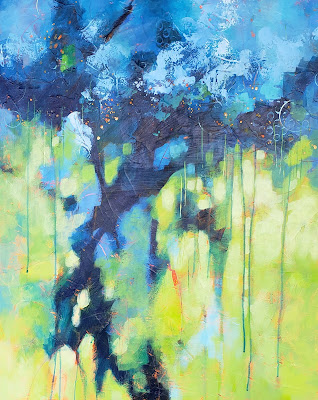
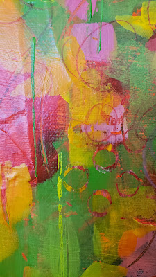
Take a look at the article about NADA Miami. I'd love to hear your thoughts on this. And now, back to painting.


Wednesday, December 11, 2013

I'm Back!

Yep, I know..... it's been way too long since posting here. This last year has found me a little scattered and trying to do too many different things - not only in the studio but online also. Too many social media sites can suck you in so I'm narrowing my focus to posting here, my Facebook page and my Etsy shop. Ok, so I can't leave Pinterest out. I'll be there too. The stack of hats I've been wearing has gotten pretty tall so it's time to clear out some clutter. Maybe if I wear fewer of them I can work more on quality rather than quantity. I think the problem with a lot of us creative types is we like to do a variety of things and that can lead to overwhelming ourselves with choices and projects. So now I'm turning my focus to the things I love most. After all, why would I want to focus more on something I don't really want to do? Makes sense right?

In painting there are 2 topics I'm most passionate about - nature and adoption. My abstracts and landscapes are both about nature. The Silent Voices series is about adoption from an original mother's viewpoint.
You can tell from the tabs above that I like to work in series. I just added 7 new pieces to the abstract section and the landscapes are ongoing. In fact I'm getting ready for a new show in February '14 in Macon GA at The 567 Center for Renewal art gallery. I love working back and forth between these two series. After a long stretch of painting landscapes it's fun to loosen up with some textures and layers in the mixed media work.


Of course the Silent Voices series is near and dear to my heart. It's a very personal series about my own story so between shows I'll be adding to that group of work also. I'm constantly thinking about it, sketching and writing down lists of words that could be included on another canvas or the narrative poetry that goes with it.


This is where I am on this beautiful December day in Florida. I'm enjoying the warm weather and looking forward to a new creative year. I hope you've been well and will come back to visit, maybe leave a comment or two.


Thursday, May 24, 2012

I went a little crazy

with texture.
 Passage 51, 12x12 mixed media

 Passage 51, detail
                                   
These two paintings are part of an ongoing series of textured mixed media abstracts that I've been working on for a while. Aside from landscapes and a couple of series involving social commentary, I love playing with different materials - papers, glue, paint, polished stones, texture gels, Styrofoam, tissue, whatever I can glue to a canvas. I just want to make something that's fun to run your hand over and feel the bumps, cracks and wrinkles. Fun!

 Passage 52, 12x12, mixed media

 Passage 52, detail