Showing posts with label colored pencil. Show all posts

Thursday, May 28, 2020

So this happened


Remember the abstract from a few posts ago? Well, I'm still on my abstract kick. I call them my pandemic paintings because it seems that these paintings are what's keeping me sane at the moment. Times are stressful and doing the layers of paint glazes, textures, swirling lines and blocks of color are just what my psyche needs at the moment.

So anyway, I've been using graphite and colored pencils (specifically Prismacolor Art Stix) for the linear elements in these paintings.

I've used several different colors for the lines on these depending on the individual piece, all the same brand. I like the idea of a high gloss finish so I've been coating them with a gloss gel and varnish. I use a palette knife to apply it because I like the texture and I don't care for the marks that a brush leaves behind.


Here are two pictures of the same painting. In the top one, you can see some faint lines and circles I made with a purple colored pencil. They're glazed over with a translucent white acrylic. The picture below shows what the painting looks like after applying the gel varnish.


That was quite the shock when I went into the studio the next morning. I guess the moisture in the acrylic did something to that particular color. It wasn't affected by the light layers of acrylic prior to this so my only thought is length of time it took for the gel layer to dry. It stays wet so much longer that it changed that purple color. It didn't do that to any of the other colors I used on other paintings. For this one it really intensified the color and made it bleed through the acrylic layers. Interesting.

So now what do I do with it? Do I go back in and do more layers to tone it down? It'll come down to which way I like the painting better so I need to leave it be for a while and then decide.

Let me know what you think! Which one do you like better?

Wednesday, September 26, 2018

Acrylic to graphite to colored pencil and back again.

It's been a busy time with lots of projects and that's a good thing! I love having multiple things to work on. I can go back and forth between projects when I get tired of something or just frustrated with how things are going and need a break. 

Switcharoo time..... I went from nests and landscapes to portraits all of a sudden. First I got a very special commission. This is a portrait that was started by an artist friend many years ago. Sadly, she passed away before finishing and her sister asked me to finish it for her. Talk about pressure. I was scared to death to do it but once I got started I was ok. I just wanted to make the artist's family proud because really - what an honor that they asked me to do it.

The other challenge was figuring out how much painting to do. There was the obvious - everything that was left undone - face, hair, both shirts and bits of the rest of the clothing. There were other things too where she had done first layers but I was afraid if I did too much it wouldn't be her painting anymore but mine. I couldn't let that happen. So anyway, this is the finished portrait. I worked mostly on the figure and the jacket he's leaning against. Irene, wherever you are, I hope you're pleased.


While working on that one I got another commission that I finished and can't show you because it's to be a surprise gift. So pretend I'm sharing a photo of a graphite portrait of 4 people. You'll see the real thing at the end of November.


Then I got another commission to do one in colored pencil. I went from acrylic to graphite and now to cp. This one I can share in progress so I shot a little bit of video while I was working on it. I'll share again when it's done.


And now I'm also working on another portrait in acrylic but I'm adding gold leaf to it. Just because. It's from a photo my daughter took and I just love it so I thought I'd play a bit. I'll share that one in the next post.

Until then, keep on painting and playing.


Wednesday, May 23, 2018

Something new and a coupon too

The last few weeks I've been focused on painting and shows so I decided to take a break and work on my Etsy shop. Sadly it's been neglected lately so it was time to get back to it and try something new. I just added a new section to the shop called Painting Project Singles. These are instant downloadable PDFs and they take you step by step through one painting.


To get the ball rolling I'm starting with projects from our book Creative Colored Pencil Workshop so if you have the book, you already have the first 2 projects. But for those who don't have the book, it's a great way to pick and choose which painting you want to do and you don't have to spend a lot to do it. I'll be doing some new projects in the future to add to the series so check in at the shop from time to time.


The first 2 projects focus on mixing colored pencil with other media. Above I'm combining them with oil pastel to paint a loose, impressionistic landscape. The project below is my froggy from Paynes Prairie. He's done with watercolor and colored pencil. I take you through each step with a full color photo and instructions. I also include a line drawing, the original source photo and materials list.


So check out the new listings and tell me what you think! Do you think it's a good idea? Do you have a particular subject you'd like to see in a step by step format like this? I'll be doing more landscapes for sure but I'm also thinking of doing some seasonal type things like pumpkins with gold leaf backgrounds for fall or maybe do one with a bird nest and eggs. You know how much I love painting those! I would love and appreciate your feedback so leave a comment if you're so inclined.

To introduce these 2 new projects I'm sharing a coupon for 50% off the Painting Project Singles that's good through May 31st.  Share with your friends and happy painting!


Saturday, August 27, 2016

Practice and save your stuff!!

Every once in a while a couple of topics come up when I'm working with art students.

1. They want it now! They want to be able to paint like an "expert" right off the bat. Practicing takes too long. They get frustrated. Some don't want to work on drawing skills but jump straight to the palette and paint. Let's get some color on that canvas. Some even want to finish that painting in the first class! We do live in an instant gratification culture.

2. When they produce something they're not that proud of they want to throw it away. Rip it up! Trash it. There's no point in keeping something they're never going to frame. It's not good enough to keep around. They say to me.... "you're a professional, I'm sure everything you do is worthy of framing". HA! They haven't seen the pile of canvases waiting to be painted over and the papers tucked away in folders that won't see the light of day.

I certainly understand the frustration! Been there, done that. Many times I've been frustrated with myself and my work. Just this week I spent 2 days really struggling with a new painting. At one point I wanted to gesso over the thing and start over. I have to keep reminding myself that every painting goes through an ugly stage and you shouldn't give up on it too soon. Keep working and most times you can get through that stage to the finish and even be satisfied (almost) with the result.

When discussions like this come up I like to pull out my old portfolio from art school. Mind you that was eons ago - 1970's - and yes, I still have a lot of that old work. I even have a piece from high school in that stash. It's the first scratchboard piece I did and the first piece of work that earned some cash. My friend Sue also did a black and white piece so we got together and had note cards printed. We packaged 3 of each design for a 6 card pack with envelopes and sold them around school and church.


Anyway, sometimes we all need to be reminded that things don't happen overnight. We all start somewhere. We're all beginners at something. No one picks up a guitar for the first time and plays like Eric Clapton. No matter what you're doing, it takes practice. There are no shortcuts to that part. Now it's usually in this part of the discussion where the word "talent" comes in but that's a topic for another time.

Right now we need to be more patient with ourselves. We need to focus more on the process than on the outcome. Every drawing that fails, every painting that's not "good enough" is still teaching us something. That teaching goes on for a lifetime! Every painting we do is a lesson in something whether it's a new color mix or a lesson in what doesn't work and we know not to do that next time. Be open to those lessons.

Don't throw out old work.

 
This is one of the first colored pencil drawings I did when I was attending the Art Institute and studying fashion illustration. Yikes!
                 
This is a colored pencil portrait I did last year.

I sure understand the temptation to throw away artwork. When I get these old pieces out and look at them I cringe. I want to go back into it and fix everything! But when looking at the old work and comparing it to the newer work I can see where I've been, how far I've come, how much I've learned, how much I've advanced in my skills.

Save your stuff! When you feel like you're not getting very far and are frustrated with what you're doing you can look back and realize- hey, I am getting better. That realization is one of the best motivators and will keep you practicing.

Give yourself a break. Keep drawing and painting. Save your work and nothing can replace the time you spend doing the work. Practice- daily if you can. There's no substitute for it and don't worry about it being frame worthy. It doesn't matter. What matters is the doing.


Friday, July 1, 2016

The "catching up" post- painting, portraits, coloring books and censorship

Wow, almost a year to the day since the last post! That is way too long!
So what have I been up to- let's see.....

Painting, painting and more painting.
Did multiple portrait commissions.
Designed and published the Masterpeace Mandala coloring books- yes, my husband and I put our skills together and jumped on that bandwagon.
Had a solo exhibition at the 567 Center for Renewal in Macon GA.
Changed a few things around on the Etsy shop
Spent a week at the beach.
Spent a week in Ohio with daughter and grandkids.
Spent the holidays in Texas with my other daughter and grandson.
Spent 3 more weeks in Texas helping my daughter when she had baby #2.
In between those trips there was more painting and working on my website.
Teaching art classes on Mondays.

I think that's it. I don't think I left out anything major. And I think the traveling will slow down this year. Of course it would be a huge help if my daughters would just move to FL!

Ok, back to the work.....

The landscapes

Golden Edge
12x12

Gold Sky Woodland
12x6

Spring Pink
12x12

These are some of the newest paintings from my studio. I'm having fun with the gold leaf again- can you tell? :) Sales at the Signature Gallery in Tallahassee and the Macon Arts Alliance in GA have been picking up- yay! My next step will be to add another gallery to the list. I'm not sure which area I want to approach so if you have any ideas about where my work would fit in, feel free to share.

The solo exhibition


BFA
48x36

This is one of the pieces from the Silent Voices series. I have 16 paintings in this series so far, all the same size. This was the group of work for my solo exhibit in GA. It caused quite a commotion and 3 of the paintings were censored from the show!! Every weekend for the duration of the show the paintings had to come down and were rehung on Mondays- not kidding! If you want to see the pieces that were censored and why, check out the post I did on my other blog. To see the rest of the pieces in the show, go to the Symbolic page on my site. 


The portraits


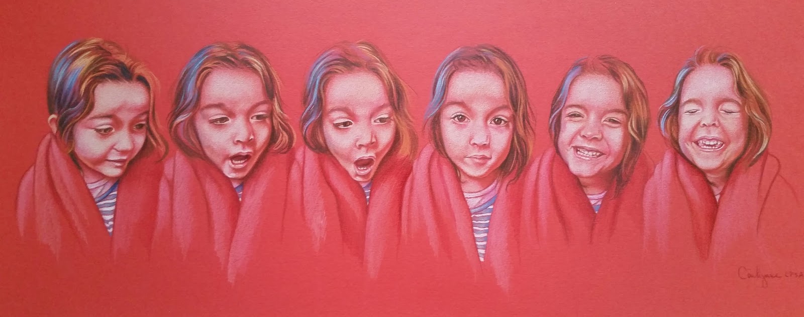
I've done several portrait commissions but this one I did for myself. My granddaughter was hanging out at the house with us one night. She had wrapped a blanket around herself and was just being goofy and making faces. I grabbed the camera and took a lot of shots and decided to compile some of them into the 6 Faces of Maxine. It's colored pencil on red Canson MiTeintes and let me tell you.... skin tones on red paper is a challenge!

The coloring books

Coloring books?! Yep, we made coloring books. There are actually 3 coloring books and 3 coloring journals. We thought it would be fun to make mandala designs and patterns inspired by line drawings of the masters. So far we have Da Vinci, Michelangelo and Mucha. In the journals we have pages that are lined and some unlined and some that have coloring designs or edges. Since this kind of work is not something I normally do it was quite the learning curve for me. Getting to know the programs required to do the designs took some time but once I got it down it was a lot of fun.


I think this catches us up and hopefully I can get back to posting here on a regular basis now that life is getting a little more regular again. So in the meantime, check out the links, leave comments here or there.... let me know what you think. And Happy 4th of July! Hope it's a great weekend.


Thursday, July 2, 2015

Stages of the latest portrait

The days of the week have all run together lately. I had a rush job portrait commission so this piece has been my only focus for the last week. It's now done and in the mail to the client. YES- made the deadline! While I was working I took quick shots with my phone so I could share the progress online. Here are the steps as it went.

 I used a blue Canson Mi-Teintes paper. I know some of the photos look more grey than blue but I did shoot with the natural light from the window in front of my drawing board.

 First layers on skin and shirts.


 I used a variety of browns and golden yellows on his shirt. Building up the skin tones was trickier- using a lot of deco orange, pumpkin and mineral orange and burnt ochre.


 To get the blond hair to be blond and not turn green on this blue paper I had to layer white pencil first to keep the yellow and blue from mixing.

 It took a little while to figure out the reds for the other shirt. What finally worked was using peach and vermillion in the light areas and permanent red for the overall color, tuscan red for the shadows.


Calling it done!

Sunday, June 7, 2015

Challenges and getting back to the drawing board


My favorite place to walk in the morning- Tuscawilla Park. This morning there was a breeze, the sun was shining, the crows were squawking and the ducks were mumbling to themselves when I walked by (you know how some words just don't look right when you spell them correctly? I had to look up squawking and it still doesn't look right to me LOL). Anyway.... it felt good to be out again. I did a very slow 2 miles today, much less than and much slower than I usually do but that's ok. 

For the last week and a half I've been fighting off a rheumatoid arthritis flare up. I've had the condition for many years and it's always been very mild- very, VERY fortunate that way. For some reason the first half of this year has been a little different. This is the second really bad flare I've had since the beginning of the year and it's been an extreme challenge. That's never happened before and this one took the wind out of my sails. Not being able to walk pissed me off but even more frustrating was not being able to paint or draw. I would look at the work sitting there- calling my name- the desire was there but the energy and physical ability just wasn't. 

Finally, yesterday, I was recovered enough to get back to the drawing board to work on this commission of Connor. Wow, did that feel good to be back. Got my Netflix shows going (Orange is the New Black) and I was able to hold and work the pencil for a few hours. If I could I would have gotten up and done a happy dance! :D

I'm excited about getting this little guy finished and I have several more commissions lined up. The next one being a house portrait in graphite. That'll be a little change of pace- looking forward to it.


Do any of you out there have similar issues with a chronic condition? I'd love to hear from you. If you're an artist how do you deal with it and your studio time? It can be pretty scary to think about the possibility of not being able to work. An artist friend of mine has had some severe vision problems and she's talked about turning to sculpture if she ever lost her sight. For me the fear is losing the use of my hands so I guess I'd have to come up with some creative way to hold a brush and pencil. We're artists right? We're creative. We can figure out a way.

So for now.... I'm back to work and not going to dwell on the negative possibilities because I can't even imagine a life without painting.

Take care everyone and have a beautiful Sunday.


Thursday, May 28, 2015

What's that saying? Do as I say........

I am constantly bugging my students about reference photos. Everyone who comes to class hears.... "Do you have your reference picture?" I'm pretty sure they get tired of hearing me ask that question but reference photos are a must. If you're going to paint something that you want to look realistic then you need to have a good reference. There are some folks in the world who think you're only a good artist if you can paint or draw anything out of your head without having to look at any references. I've heard people say this very thing and it's a very big misconception. Even the old masters used references. They might not have had a nifty DSLR camera or a phone that takes pictures but they used other methods including having models pose, setting up still lifes and dioramas in their studios or painting plein air.

So, after all that, after all the years of nagging people for good reference pics, did I take my own advice? I started a portrait commission recently. I got the reference photo via email and then printed it out. It was pretty blurry but I thought I could still work from it. Boy was I wrong. I got the basic shapes down (or so I thought) and proceeded to add color. The longer I worked the harder it became. I just couldn't tell what was going on. If you're working on something like a face you'd better have the detail info. Below is the photo I was trying to work with.


Check out this next photo..... what a difference a few more pixels make. Thankfully my client was able to get me a better image. So that's what this little guy's eyes look like! And there are pineapples on his hat- I had no idea what those orange blobs were.


When I went back to work on the portrait I had to re-draw portions of the hat and re-draw all the facial features. It certainly would have saved me time had I waited for a better picture to start with.


This is the portrait in progress. Lots to do yet and I still have a few adjustments to make on the face but it certainly is a lot easier to work with a good photo reference. Lesson learned: take my own damn advice! :)


Friday, May 15, 2015

Playing

So it's a couple of weeks after the workshop and I've been busy getting back into the routine of walking at the park, classes, portrait commissions and landscape painting. In between those things I get to play with little people like these 2 lovely ladies...


I mean, look at those faces- how can I resist? Sometimes I just have to put the brushes down and pick up a puppet or a book and snuggle with little girls on my lap.

Okay, back to art stuff.... while I was at the workshop in Live Oak I was introduced to a new paper (new to me anyway). It's called TerraSkin and one of the ladies taking the class was kind enough to bring a piece of it for me to play with. It intrigued me so when I got home I ordered a pad. What is TerraSkin? It's made from rocks. That alone was enough for me to try it. Here are some basics about it from their website

  • TerraSkin is a combination of mineral powder (>75%) and a small quantity (<25%) of non-toxic resin combined to create an environmentally friendly paper.
  • The production of TerraSkin requires no water, so the TerraSkin papermaking process incurs no water pollutants.
  • Used TerraSkin paper will start to degrade under the proper environmental conditions of high heat, moisture and UV light.
  • Most importantly, in producing TerraSkin, the harvesting of trees is unnecessary, thereby safeguarding the natural environment’s beauty and biodiversity for all living beings.
  • TerraSkin also has beautiful printing capabilities and a unique texture and feel. Because the paper is fiberless, it does not absorb ink like regular paper and also uses less ink than regular paper. Images stay much crisper and cleaner because the ink doesn’t bleed.
  • TerraSkin is water – resistant and inherently strong and durable.

It was originally formulated for commercial uses such as packaging, labels, banners, printing etc.... so there isn't anything about it's use for artists on the website but if you poke around online you can find info and videos about using this stone paper.

Here is my first time playing with TerraSkin.... I wanted to try mixed media with portrait work so I figured this paper would be ideal for it. It's very similar to Yupo paper but has a slight texture where Yupo is very slick. Because of the texture it accepts colored pencil pretty well. You can't build up as many layers as you can on Canson Mi-Teintes or watercolor paper but you can do some layering. I started this one by drawing the face first with colored pencils; I did a few layers of skin tones. Then I started playing with very loose washes of blue watercolor. The paper surface is slightly porous so it absorbs a little of the paint but a lot sits on the surface and takes a while to dry.


When it was dry I started playing with acrylic paint, some right from the tube and some watered down. I also sprayed it with water while the paint was still wet. I scratched into the paint with the handle end of the brush to make some marks and then I kept layering acrylic and watercolor. At one point I splattered the blue and then sprayed it to encourage it run across the face and then let the puddles dry where they were.


The background really looks a mess but it's fun to let loose and experiment. I can always go back into it and paint some more layers over it and change the look completely. I can definitely see playing with these techniques some more. If you work on paper and like playing with mixed media, give this paper a try.

Time to pick up a brush.... 


Monday, May 4, 2015

What's in Live Oak?


When I told someone I was going to do an art workshop in Live Oak they asked.... "there are enough people in Live Oak that would take an art workshop?? There's nothing in Live Oak!" Well, this past weekend I had the pleasure of going to Live Oak to teach a colored pencil portrait workshop and yes, there are artists there. In fact, there are lots of them and with quite a bit of talent! AND.... 6 people from Live Oak have been accepted to the upcoming CPSA International Exhibition in Atlanta this summer so I'd say Live Oak does have something good going on.


What a wonderful group of ladies. They were funny, kind, sweet, generous and like I said - amazingly talented. In fact a few of them had me wondering what in the world they were doing there. I want to take a class from them!


Cathy has such an intuitive way of working where she uses so much unusual color in her portraits. She is an inspiration to me!


Suzanne working on a large portrait of her daughter. I'm hoping she'll send me a photo of the finished piece.


Anda was just whipping out this portrait of her hubby. She's great at capturing light.


Marilyn's portrait of her little great-nephew is going to be a stunner.
 Can't wait to see it when it's finished.

If anyone ever asks you- what's in Live Oak? Tell them about all the fab colored pencil people who live there and tell them to get some fried chicken at the Dixie Grill.


Friday, April 24, 2015

Hanging on to winter


Fire and Ice
18x18

As I sit in my studio enjoying the air conditioning on a hot, Florida spring day, I'm still enamored with ice. I think I'm trying to hold off the inevitable - VERY hot summer days. This is the third ice painting so far, finished this one yesterday. There's more I want to do in my quest of hanging on to winter but for now I have to set the brushes aside and focus on prepping for a colored pencil portrait workshop I'm doing in Live Oak next week and then I have several portrait commissions to work on. It's good to be busy!

I love to see what other artists are doing. While I've been working at the easel I have my laptop open on the table so I can watch/listen to stuff while I paint. This week I've been re-watching the Work of Art reality show from Bravo. I found them on YouTube. I saw them when they were first aired but it's been a while. I loved watching the process of the artists. My only wish is that Bravo would make more seasons. It's very sad that they stopped after season 2.

So 2 questions for you..... What are you working on? (feel free to share pics) and Do you know of any good documentaries on art- preferably something on contemporary artists?

Back to work...... 
Have a great weekend!

Saturday, March 21, 2015

The stages of Pouty Face

Many times when working on a portrait I post pictures of the piece in progress on my Facebook page. I've found that people really love to see the progression and the layers build up. I've noticed that artists and non-artists alike enjoy seeing how it works so here is the progression of colored pencil layers as I was working on the Pouty Face portrait I shared in the last blog post.


Here I've just got the basic outline in and I'm working out my palette while starting to get some darks blocked in.


You can see that little strip of paper on the side- that's where I test my colors. For this portrait I'm working on a dark blue Canson pastel paper. It's actually darker than it looks in the photos. When I took these pics I was just using my phone at the drawing board. The board is right in front of 2 windows so sometimes the colors shift depending on the time of day I took the picture.


So here I'm beginning to build up skin tones. Any time I'm working on colored paper I cut an extra strip of the same color paper to test the pencils on- especially for skin. On this paper I couldn't use any of my usual portrait colors that have yellow in them. You know what happens when you mix yellow and blue..... he didn't need to have green skin.


I used lots of peachy and orangey tones to work the skin. Surprisingly deco orange got used a lot. I hadn't considered it right away but it really worked.


In this pic the lips look a lot more orange than they really were. They were a bit of a challenge though to get them pink enough without them turning purple on the paper.


He's almost done here- just building up the background colors and the red of his shirt. I went back into the eyes to push the values a little more and then back into the hair to fill it out with more strands.


Pouty Face is done and Pouty Face happens to be my youngest grandson. He is quite the character so I'm sure I'll be doing more portraits with his very expressive self.


Saturday, March 14, 2015

What have I been doing?

Boy do I have some updating to do!! I've done a lot of work since posting last so I'll share a few pics...

These are brand new landscapes inspired by aerial photos I took as I was flying into Tampa airport. These pieces are very textured. I used Super Heavy Gesso and many layers of drybrushing. Size wise they're 11x14 and 12x12.


This one is the newest tree piece and the largest one I've done- it's 48x36 and it has tons of texture. I covered the entire canvas with layers of tissue paper.


Then..... there's the colored pencil work. I've been doing some commission work and of course doing portraits of my grandbabies. Pouty Face is the one I just finished this past week and I think it's one of my faves. Harlen is such a character I know I'll be doing more with his beautiful face.


This gorgeous animal is Winston and he was a commission piece for a dear friend of mine. He was a real joy to paint and a real challenge too. That hair!!!


Yep, still partying. Friday Painting Parties are still happening. In fact I'm now doing an afternoon session along with the evening. Last month we did a scene from Tuscawilla Park - Ibis Morning, a line up of birds along the waters edge.


This month we're doing a landscape....


Just one more bit of news for now- a show at Gateway Bank! Check this out. The reception is passed but the show is up until May 26th.


There's a sampling of what I've been up to. Leaving for now but I'll be back! I swear! I'll be adding new work to the pages up at the top and I'll post more of the portrait work including photos of the work as it progresses. See you soon.